Blink
Addicted Member 
Posts: 1,699
|
Post by Blink on Jan 24, 2008 23:53:15 GMT -5
|
|
|
|
Post by Moldy Cheese on Jan 25, 2008 0:33:59 GMT -5
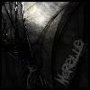
Like I told you on MSN, you'd be better off with actual stocks of wood patterns instead of Photoshopped ones. Current one looks too plasticy. Try sxc.hu for some wood/plank patterns.
|
|
Simply Amor
Pro Member  I am currently making the forum for my fan club :o
Posts: 503
|
Post by Simply Amor on Jan 25, 2008 2:10:19 GMT -5
Actually...
I think the problem is... the pattern is too uniform. Give the texture more variety. A knot here and there... A few curvy lines around... Things of that sorts. Vary the darkness and lightness of the lines.
Look around at different real wood textures and see how they look... nothing's really particularly the same.
|
|
00ki3
Senior Member  I r b 1337
Posts: 275
|
Post by 00ki3 on Jan 25, 2008 6:51:36 GMT -5
What Amor said, and the cloud in the top right has too much of an edge. Otherwise not bad.
|
|
Artz
Full Member 
Posts: 134
|
Post by Artz on Jan 25, 2008 14:13:24 GMT -5
Strictly from a user-perspective (I'm not exactly a pro at graphics design/creation) But... I quite like the grass. Kinda looks more like trees, but tis cool for texture. I also do like the wood in it, but maybe you should have the light brown banner - that you used on the other image you made: www.tyrogame.com At the top (where the "Welcome to Tyro" text is). Plus that might look good in a dark, blood-red. But good job, looks great  |
|
Zac Attack
Pro Member
With God ALL things are possible!
Posts: 918
|
Post by Zac Attack on Jan 25, 2008 19:14:05 GMT -5
Like the design Blink, really coolio.
|
|
Blink
Addicted Member
Posts: 1,699
|
Post by Blink on Jan 25, 2008 20:07:20 GMT -5
Like I told you on MSN, you'd be better off with actual stocks of wood patterns instead of Photoshopped ones. Current one looks too plasticy. Try sxc.hu for some wood/plank patterns. Couldn't find any textures there. Thanks for the feedback though. Actually... I think the problem is... the pattern is too uniform. Give the texture more variety. A knot here and there... A few curvy lines around... Things of that sorts. Vary the darkness and lightness of the lines. Look around at different real wood textures and see how they look... nothing's really particularly the same. Yeah, thanks for the suggestion. I'm working on adding knots in the wood. What Amor said, and the cloud in the top right has too much of an edge. Otherwise not bad. Not sure what edge you are referring to. Looks fine to me. Strictly from a user-perspective (I'm not exactly a pro at graphics design/creation) But... I quite like the grass. Kinda looks more like trees, but tis cool for texture. I also do like the wood in it, but maybe you should have the light brown banner - that you used on the other image you made: www.tyrogame.com At the top (where the "Welcome to Tyro" text is). Plus that might look good in a dark, blood-red. But good job, looks great I played with adding the banner but wanted to have the text "Welcome to Tyro" so I used more wood. Loved reading your feedback, thanks a bunch. It's good to hear from "a user perspective" as you call yourself. Like the design Blink, really coolio. Thanks. |
|