00ki3
Senior Member  I r b 1337
Posts: 275
|
Post by 00ki3 on Dec 15, 2007 3:03:13 GMT -5
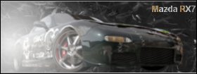
 C&C? |
|
Kahless
Administrator  Guitar Star
Posts: 1,045
|
Post by Kahless on Dec 15, 2007 21:51:41 GMT -5
Pretty decent, the colors are good and the text is cool, but the stock should be a little more blended. Just use a grunge brush as an eraser and click around the edges and then fade it in
|
|
Beeeeeel
Forum Prostitute  Official wA Name Trend Starter
Posts: 1,308
|
Post by Beeeeeel on Dec 16, 2007 0:08:30 GMT -5
I'm not too fond of it.
For one, the stock doesn't go with the background. You should have done something with a black and white texture (which can actually look really nice). The blue just doesn't work with the stock.
The lighting is way too intense and really takes away from the focal point and quality of the signature. You really need to either decrease that or just remove it all together.
The letters... I don't know, they work I guess. Nothing really to say about that part.
And don't erase the front of the stock. I can see that you either lowered the opacity, or you tried to erase it to blend it. Don't do that. In my opinion, it doesn't look that great.
Sorry, I'm a harsh guy I guess. I try to avoid pampering people, don't take it offensively.
Good luck.
|
|
00ki3
Senior Member  I r b 1337
Posts: 275
|
Post by 00ki3 on Dec 17, 2007 1:20:22 GMT -5
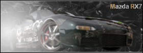
Update:   C&C? |
|
|
|
Post by Soul Glow Activature on Dec 17, 2007 15:23:47 GMT -5
new ones are a great improve ment. alot better, kinda drak, and it is hard to define parts of the car, espically the front, maybe a little more light. but looks good other than that.
|
|
Arucard
General Moderator  The King of Kings
Posts: 1,363
|
Post by Arucard on Dec 21, 2007 1:38:25 GMT -5
new ones are a great improve ment. alot better, kinda drak, and it is hard to define parts of the car, espically the front, maybe a little more light. but looks good other than that. agree. They are alot better now just maybe a little more lighter and should be good to go |
|