|
|
Post by Sanus Compleo on Nov 22, 2007 14:37:53 GMT -5
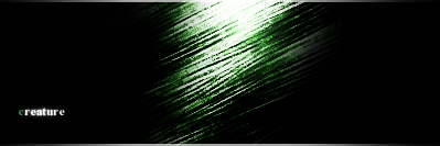
 Yush I know i put it in the sotw, but it's staying as is no matter what. It was supposed to look like reptile skin, but I just got tired half way through and said: 'done'. No 3d thingy, just brushing, my special lighting, *@Sunjo: i've got special lighting too! MWAHAHA* and the brushing wasn't a brush, I mean i took a circle brush, and did this with various colors, and messed with it until I got something I liked, then I used my ancient gimpese lighting techniques to make it look kewl. Text is san serif, because I'm too lazy to look on dafont for anything good. |
|
Blink
Addicted Member 
Posts: 1,699
|
Post by Blink on Nov 26, 2007 8:15:06 GMT -5
Sure it looks cool, but there really isn't much to comment on. I don't know enough about the inner workings of photoshop to recommend how to make it look more like skin/3d thing.
So neat affect, but It sure doesn't look finished.
|
|
teg
Junior Member  I will keep you waiting.
Posts: 92
|
Post by teg on Nov 26, 2007 8:51:41 GMT -5
This signature is way too boring and plain. The text Creature, should have meaning in the signature, and it doesn't because i do not see a "creature." You really need to do more with it.
|
|